Violation Rate Distribution
knitr::opts_chunk$set(
  warning = FALSE,
  message = FALSE)
library(tidyverse)
library(dplyr)
library(rvest)
library(purrr)
library(ggplot2)
library(modelr)
library(mgcv)
library(patchwork)
library(viridis)
library(fastDummies)
set.seed(1)childcare_inspection_df = read_csv("./data/DOHMH_Childcare_Center_Inspections.csv") %>%
janitor::clean_names() %>%
distinct() %>%
select(center_name, borough, zip_code, status, age_range, maximum_capacity,program_type, facility_type,
child_care_type, violation_category,
violation_status,violation_rate_percent:average_critical_violation_rate,regulation_summary,
inspection_summary_result) %>%
drop_na(zip_code, age_range, violation_rate_percent,public_health_hazard_violation_rate, critical_violation_rate) %>%
filter(maximum_capacity != 0) %>%
mutate(
educational_worker_ratio = total_educational_workers/maximum_capacity,
program_type = tolower(program_type),
facility_type = tolower(facility_type),
borough = as.factor(borough),
status = as.factor(status),
program_type = as.factor(program_type),
facility_type = as.factor(facility_type),
child_care_type = as.factor(child_care_type),
age_range = as.factor(age_range)
) %>%
filter(program_type != "school age camp")center_specific_df = childcare_inspection_df %>%
relocate(center_name, program_type) %>%
group_by(center_name, program_type) %>%
mutate(
n_na = sum(is.na(violation_category)),
n_violation = sum(!is.na(violation_category)),
rate = n_violation/(n_violation + n_na)) %>%
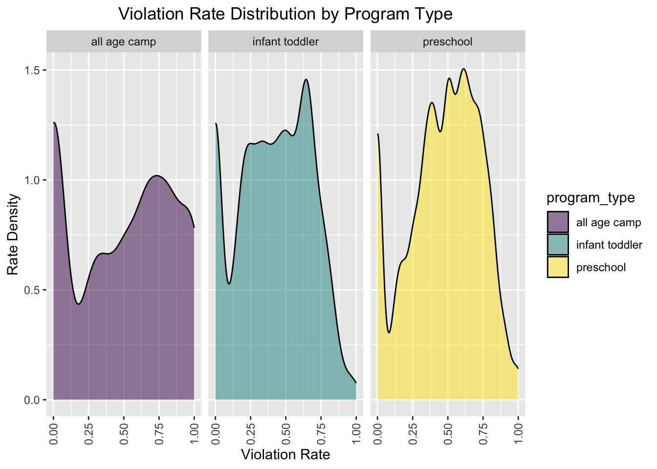
arrange(center_name, program_type)Violation Rate Distribution by Program Type
Density plot
center_specific_df %>%
  ggplot(aes(x = rate, fill = program_type)) +
  geom_density(alpha = .5) +
  facet_grid(~program_type) +
  viridis::scale_fill_viridis(discrete = TRUE) +
  theme(axis.text.x = element_text(angle = 90, vjust = 0.5, hjust=1),plot.title = element_text(hjust = 0.5)) +
    labs(
    title = "Violation Rate Distribution by Program Type",
    x = "Violation Rate",
    y = "Rate Density"
  )
Interpretation
From the density plot above, we can learn that the “preschool” program type has the highest rate density when the violation rate is about 0.625, which may probably mean that childcare centers with preschool program type have a higher mean violation rate.
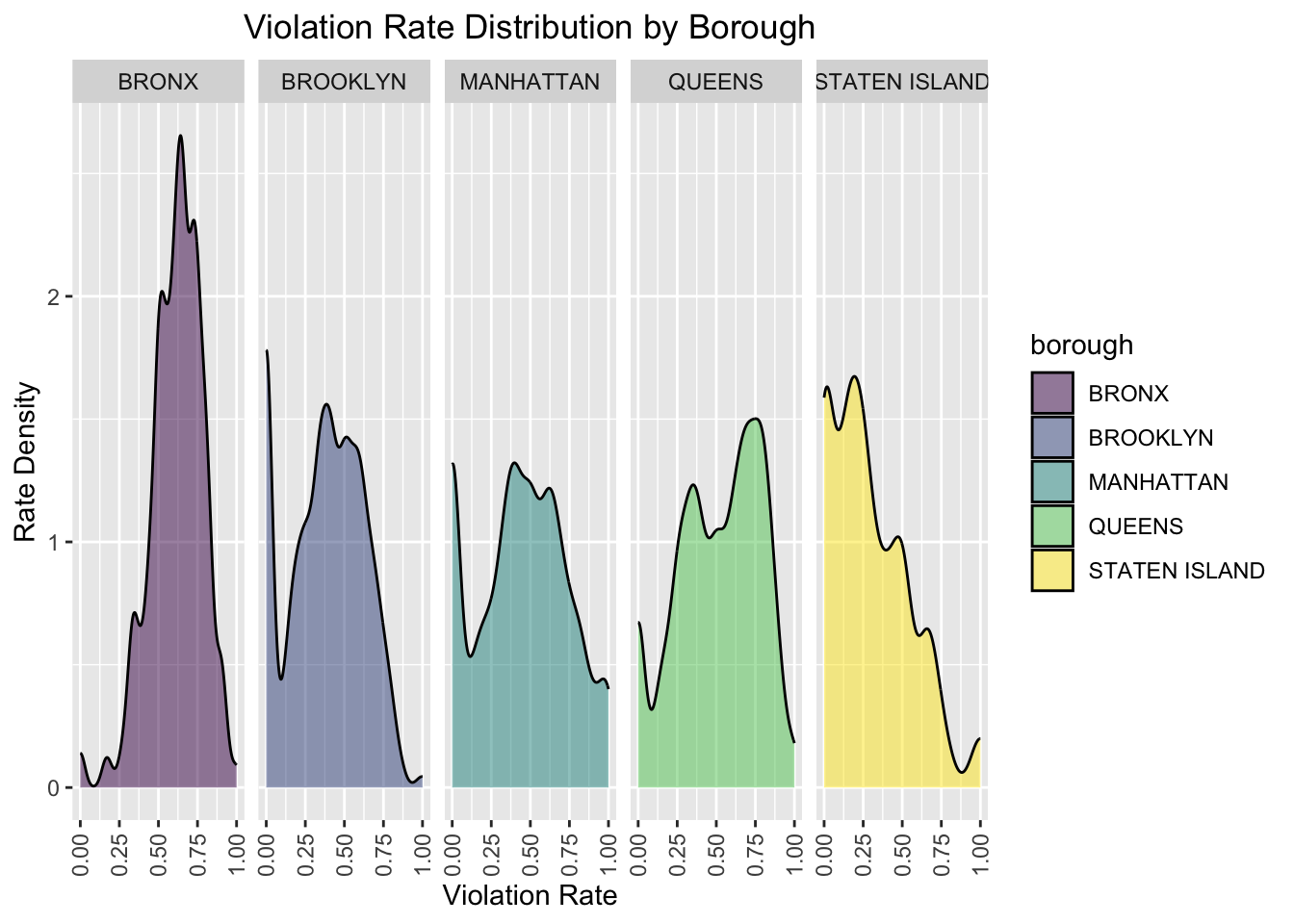
Violation Rate Distribution by Borough
Density plot
center_specific_df %>%
  ggplot(aes(x = rate, fill = borough)) +
  geom_density(alpha = .5) +
  facet_grid(~borough) +
  viridis::scale_fill_viridis(discrete = TRUE) +
  theme(axis.text.x = element_text(angle = 90, vjust = 0.5, hjust = 1),plot.title = element_text(hjust = 0.5)) +
    labs(
    title = "Violation Rate Distribution by Borough",
    x = "Violation Rate",
    y = "Rate Density"
  )
Interpretation
From the density plot above, we can learn that Bronx has a higher density of high violation rate compared with other boroughs.